Digital marketing campaign
Black Friday promotional sale for a meditation app
UIUX
Web Design
Marketing
Digital marketing campaign
Black Friday promotional sale for a meditation app
UIUX
Web Design
Marketing

Role
UIUX Designer
Marketer
Tools
Figma
Google Analytics
Heat map
Microsoft Clarity
Timeline
May 2025
Role
UIUX Designer
Marketer
Tools
Figma
Google Analytics
Heat map
Microsoft Clarity
Timeline
May 2025
Project Overview
Background & Purpose
As a school assignment, I designed a digital marketing campaign for a fictional meditation app, MindEase.
The campaign focused on converting free users to premium through cohesive branding, responsive landing pages, and platform-specific ads.
Project Overview
Background & Purpose
As a school assignment, I designed a digital marketing campaign for a fictional meditation app, MindEase.
The campaign focused on converting free users to premium through cohesive branding, responsive landing pages, and platform-specific ads.
Brand Overview
To help people experience mindfulness as a natural part of daily life, bringing calm, focus, and emotional balance when it’s needed most.
Vision
MindEase helps people reconnect with themselves through guided meditation, mood tracking, and daily mindfulness tools. We aim to provide a calm, welcoming space that fits into busy lives.
Mission
Core Values
Mindfulness
Everything begins
with awareness
Peace

A calm mind supports
a calm life
Simplicity

Minimalist design,
intuitive use
Core Values
Mindfulness
Everything begins
with awareness
Peace
A calm mind supports
a calm life
Simplicity
Minimalist design,
intuitive use
Challenge & Goal
To help people experience mindfulness as a natural part of daily life, bringing calm, focus, and emotional balance when it’s needed most.
Goal
Challenge
Create a high-converting, trust-building digital campaign for a meditation app during the highly competitive Black Friday weekend.
Deliver clear, consistent messaging across email, landing pages, and social media formats.
Persuade free users to upgrade to premium within a limited-time 50% off offer.
Maintain the app’s calming and peaceful brand identity without using overly aggressive or sales-driven visuals.
To help people experience mindfulness as a natural part of daily life, bringing calm, focus, and emotional balance when it’s needed most.
Key Message
Persona
Persona 1
Basic Information

Name
Alex
Age
33
Occupation
UX Designer working remotely
Goal
Reduce anxiety and be more present
Build a consistent mindfulness habit
Pain Points
Constant Zoom fatigue
Difficulty separating work and home life
Trouble sleeping and staying focused
Why MindEase?
Quick meditations between meetings
Sleep stories for better rest
Mood tracking for daily reflection
Persona 2
Basic Information

Name
Maya
Age
21
Occupation
University student
(Psychology major)
Goal
Create a balanced daily routine
Learn mindfulness to manage emotions
Pain Points
Overwhelmed by exams and deadlines
Excessive screen time/social media fatigue
Wants to improve her mental well-being
Why MindEase?
Simple daily calm rituals
Guided journals and mood tracking
No ads, just pure, peaceful focus
Persona
Persona 1
Basic Information
Name
Alex
Age
33
Occupation
UX Designer working remotely
Goal
Reduce anxiety and be more present
Build a consistent mindfulness habit
Pain Points
Constant Zoom fatigue
Difficulty separating work and home life
Trouble sleeping and staying focused
Why MindEase?
Quick meditations between meetings
Sleep stories for better rest
Mood tracking for daily reflection
Persona 2
Basic Information
Name
Maya
Age
21
Occupation
University student
(Psychology major)
Goal
Create a balanced daily routine
Learn mindfulness to manage emotions
Pain Points
Overwhelmed by exams and deadlines
Excessive screen time/social media fatigue
Wants to improve her mental well-being
Why MindEase?
Simple daily calm rituals
Guided journals and mood tracking
No ads, just pure, peaceful focus
Visual Identity
Logo Concept
MindEase
MindEase
Bird
Leave
Lotus
The MindEase logo is inspired by three natural elements: a leaf, a bird, and a lotus. Each symbol was thoughtfully chosen to reflect the brand’s values and emotional tone.
The leaf stands for simplicity, growth, and connection to nature. The bird represents peace and emotional freedom, gently encouraging users to slow down and breathe. The lotus carries deeper meanings of purity, strength, and renewal, expressing the personal transformation that mindfulness can offer over time.
These elements come together to form a calm and balanced visual identity that supports the app’s mission to bring clarity and ease into everyday life.
Typography
Logo Font
A
a
Montserrat
Alternates
Medium
MindEase
MindEase
MindEase
Headline Fonts
A
a
Outfit
Semi Bold
Semi Bold 80px - Heading 1
Semi Bold 64px - Heading 2
Semi Bold 48px - Heading 3
Semi Bold 40px - Heading 4
Semi Bold 32px - Heading 5
Semi Bold 30px - Heading 6
Semi Bold 24px - Heading 7
Semi Bold 20px - Heading 8
Semi Bold 18px - Heading 9
Semi Bold 16px - Heading 10
Body Text Fonts
A
a
Outfit
Regular
Regular 48px - Body 1
Regular 40px - Body 2
Regular 32px - Body 3
Regular 24px - Body 4
Regular 20px - Body 5
Regular 16px - Body 6
Color Palette
This soft, off-white tone was chosen as the main background color to create a clean and calming space. It brings a sense of lightness and quiet, allowing other elements to breathe and stand out without distraction.
It brings focus and structure to the layout while reinforcing the brand’s connection to mindfulness and nature. Its calming yet confident tone supports clarity without being overpowering.
Off-white
Main Color
HEX #F9F5EF
R: 249 G: 245 B:239
Light Green
HEX #85AC85
R: 133 G: 172 B:133
Secondary Color
Accent Color 1
Green
HEX #389A6E
R: 56 G: 154 B:110
Accent Color 2
Orange
HEX #FD7140
R: 253 G: 113 B:64
A muted green inspired by nature, this color supports a sense of balance and renewal. It helps reinforce the connection to mindfulness and natural well-being while maintaining a grounded, trustworthy feel.
This warm, energizing orange is primarily used for call-to-action buttons to create a sense of urgency and encourage user interaction.
Dark
HEX #494949
R: 73 G: 73 B:73
Dark Purple
HEX #674253
R: 103 G: 66 B:83
White
HEX #674253
R: 103 G: 66 B:83
Soft Green
HEX #D0DBCA
R:208 G: 219 B:202
Visual Identity
Logo Concept
MindEase
MindEase
Bird
Leave
Lotus
The MindEase logo is inspired by three natural elements: a leaf, a bird, and a lotus. Each symbol was thoughtfully chosen to reflect the brand’s values and emotional tone.
The leaf stands for simplicity, growth, and connection to nature. The bird represents peace and emotional freedom, gently encouraging users to slow down and breathe. The lotus carries deeper meanings of purity, strength, and renewal, expressing the personal transformation that mindfulness can offer over time.
These elements come together to form a calm and balanced visual identity that supports the app’s mission to bring clarity and ease into everyday life.
Typography
Logo Font
A
a
Montserrat
Alternates
Medium
MindEase
MindEase
MindEase
Headline Fonts
A
a
Outfit
Semi Bold
Semi Bold 80px - Heading 1
Semi Bold 64px - Heading 2
Semi Bold 48px - Heading 3
Semi Bold 40px - Heading 4
Semi Bold 32px - Heading 5
Semi Bold 30px - Heading 6
Semi Bold 24px - Heading 7
Semi Bold 20px - Heading 8
Semi Bold 18px - Heading 9
Semi Bold 16px - Heading 10
Body Text Fonts
A
a
Outfit
Regular
Regular 48px - Body 1
Regular 40px - Body 2
Regular 32px - Body 3
Regular 24px - Body 4
Regular 20px - Body 5
Regular 16px - Body 6
Color Palette
This soft, off-white tone was chosen as the main background color to create a clean and calming space. It brings a sense of lightness and quiet, allowing other elements to breathe and stand out without distraction.
Main color
It brings focus and structure to the layout while reinforcing the brand’s connection to mindfulness and nature. Its calming yet confident tone supports clarity without being overpowering.
Accent color 1
Off-white
Main Color
HEX #F9F5EF
R: 249 G: 245 B:239
Light Green
HEX #85AC85
R: 133 G: 172 B:133
Secondary Color
Accent Color 1
Green
HEX #389A6E
R: 56 G: 154 B:110
Accent Color 2
Orange
HEX #FD7140
R: 253 G: 113 B:64
A muted green inspired by nature, this color supports a sense of balance and renewal. It helps reinforce the connection to mindfulness and natural well-being while maintaining a grounded, trustworthy feel.
Secondary color
This warm, energizing orange is primarily used for call-to-action buttons to create a sense of urgency and encourage user interaction.
Secondary color
Dark
HEX #494949
R: 73 G: 73 B:73
Dark Purple
HEX #674253
R: 103 G: 66 B:83
White
HEX #674253
R: 103 G: 66 B:83
Soft Green
HEX #D0DBCA
R:208 G: 219 B:202
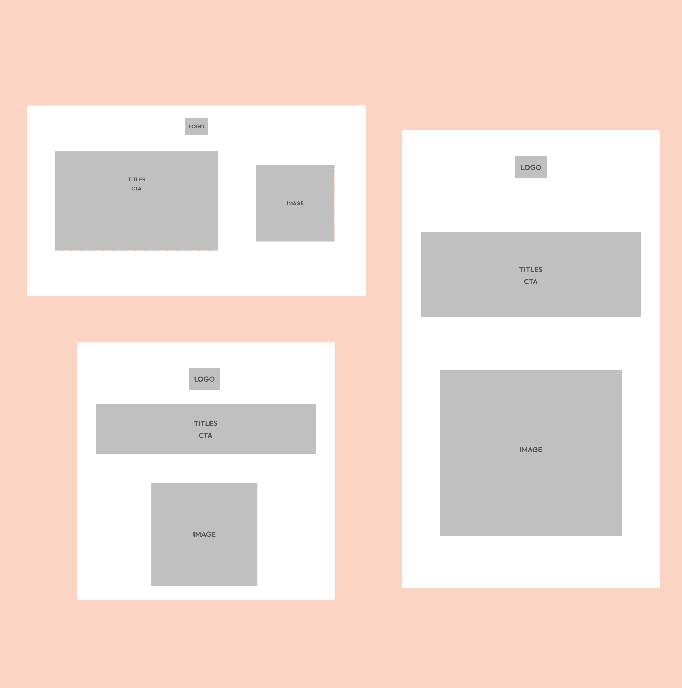
Wirefremes
Landing Page

News Letter

Social Media Ad
Wirefremes
Landing Page
News Letter
Social Media Ad
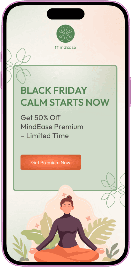
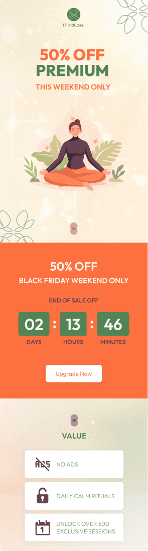
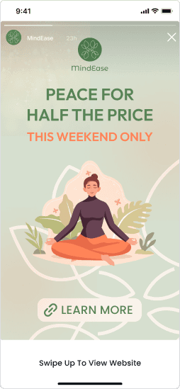
High-Fidelity Prototype Of Landing Page
iphone 16
mockup
393×852
6.1’

iphone 16
mockup
393×852
6.1’


iphone 16
mockup
393×852
6.1’
UI Design & Intentions
High-Fidelity Prototype Of Landing Page
iphone 16
mockup
393×852
6.1’
iphone 16
mockup
393×852
6.1’
iphone 16
mockup
393×852
6.1’
UI Design & Intentions
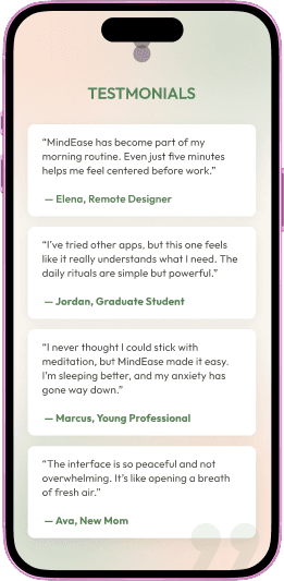
High-Fidelity Prototype Of News Letter & Social Medias
High-Fidelity Prototype Of News Letter & Social Medias
Landing Page
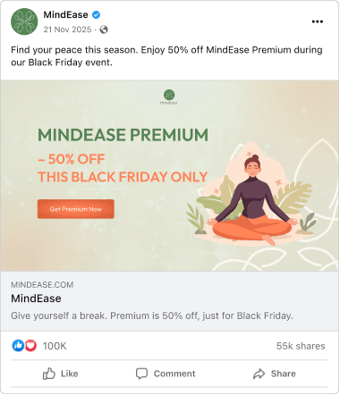

Landing Page
Design highlights
Typography, colors, and button styles were aligned across all assets to ensure a cohesive and unified user experience on every platform.
Consistent Visual Language
Green and orange, as complementary colors, were used for CTAs and countdown sections to draw attention effectively while maintaining visual balance.
Strategic Use of Contrast
Soft off-white and natural green tones were chosen to reflect the brand’s mindfulness values and preserve a sense of calm, even in a promotional setting.
Maintaining Brand Calmness
A countdown timer, benefit-focused bullet points, and clear, visually distinct CTA buttons were used to create urgency and guide users toward upgrading during the limited-time offer.
Encouraging Timely Upgrades
@2025 Designed and built by Himari